
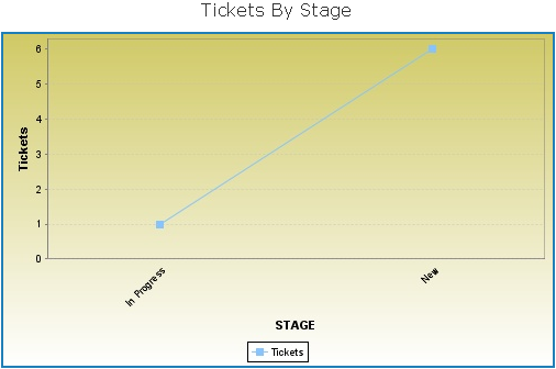
You will learn now how to format the 'GF_TicketsByOwner' data view. By default, the chart report represents the data using a 3D bar chart. You will be shown how to convert the bar chart to other forms of charts, such as Pie and Line.
The rest of this section will help you understand how to format the 'GF_TicketsByOwner' bar chart view.
To format the bar chart:
- Optional. To open the data view,
- In the JasperReports Server, go to View > Search Results. In the Search field, enter the data view name, and click the search icon. The Search results appear, displaying reports and data views that match the search criteria.
Or
If you know the location of report in the repository, go to View > Repository menu.
- After you locate the ad hoc view, click the view, or right-click the report, and choose Open in the context menu.
- In the JasperReports Server, go to View > Search Results. In the Search field, enter the data view name, and click the search icon. The Search results appear, displaying reports and data views that match the search criteria.
- At the top of bar chart, click the text Click to add a title and enter the title as 'Tickets By Owners.'
- In the Measures layout band, right-click the 'TITLE field, and choose Edit Legend Label in the context menu. Enter 'Tickets' in the Label field, and click Submit.
- Optional. To add or remove fields:
- In the Measures or Group layout band, click X next to a field to remove the fields.
- Right-click a field, choose Add as Measure in the context menu to add a field to the Measure layout band, or choose Replace Group in the context menu to replace the group in the Group layout band.
- Right-click in the chart area, and choose Remove Group in the context menu.
- By default, measure and group labels and legend are displayed in the chart area. To hide labels and legend, right-click in the chart area, mouse over the Legend and Labels in the context menu, and choose one of the options: Measures Title, Group Title, or Legend.
- Right-click in the chart area, mouse over the Display Options in the context menu, and choose Fill Background to apply the background color for the chart.
- Go to the right bottom in the chart area, and when the
 icon appears, left-click the icon, and drag the mouse to resize the chart area. After you finish formatting, the 3D Bar chart appears as:
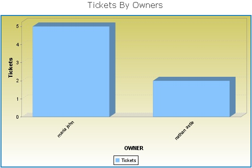
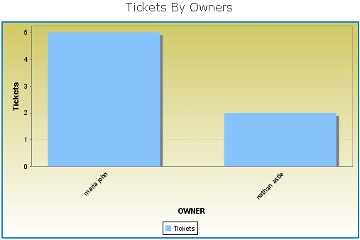
- Right-click in the chart area, mouse over the Display Options in the context menu, and choose Flat Bars. The Flat Bar chart appears as:
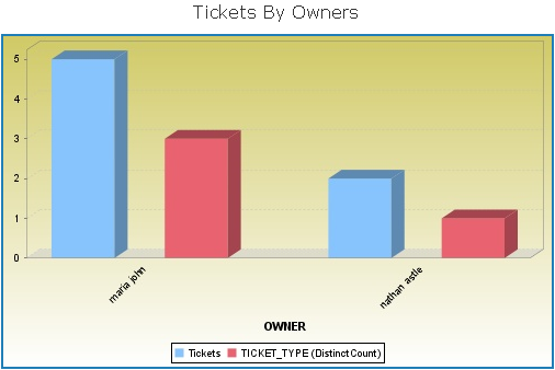
- Now, drag the TICKET_TYPEfield in the Measures layout band. Right-click the TICKET_TYPEfield, mouse hover the Change Summary Function in the context menu, and choose Distinct Count. The Simple Series 3D Bar chart appears as:
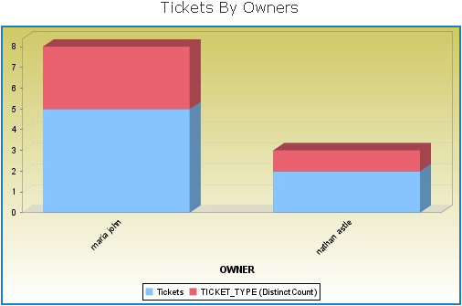
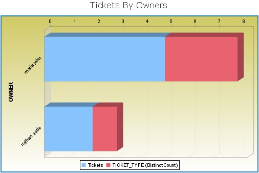
- Right-click in the chart area, mouse hover the Display Options in the context menu, and choose Stacked Series. The Stacked Series 3D Bar chart appears as:
- Right-click in the chart area, mouse over the Display Options in the context menu, and choose Horizontal Bars. The Horizontal 3D Bar chart appears as:
- Now, drag the STAGE field in the Group layout band to replace the OWNERfield, and click X next to TICKET_TYPEto remove the field.
- Right-click in the chart area, mouse over the Display Options in the context menu, and choose Horizontal Bars. The Horizontal 3D Bar chart appears as:
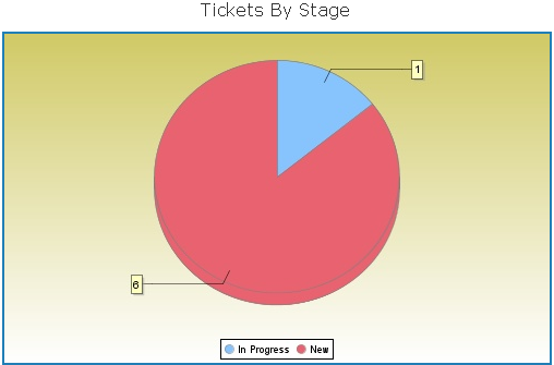
- Right-click the chart, mouse hover the Change Chart Type in the context menu, and choose Pie. The Pie chart appears as:
- Click
 and choose Save Report to save the report. Choose Save Report As... to save the report separately for each chart type.
 icon appears, left-click the icon, and drag the mouse to resize the chart area. After you finish formatting, the 3D Bar chart appears as:


 and choose Save Report to save the report. Choose Save Report As... to save the report separately for each chart type.
